Content List
Guided Healthcare Experience Redesign
My Role:
Lead Product Designer
Client:
Alight Solutions
Overview
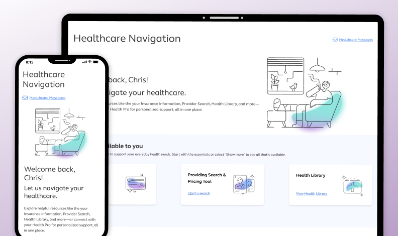
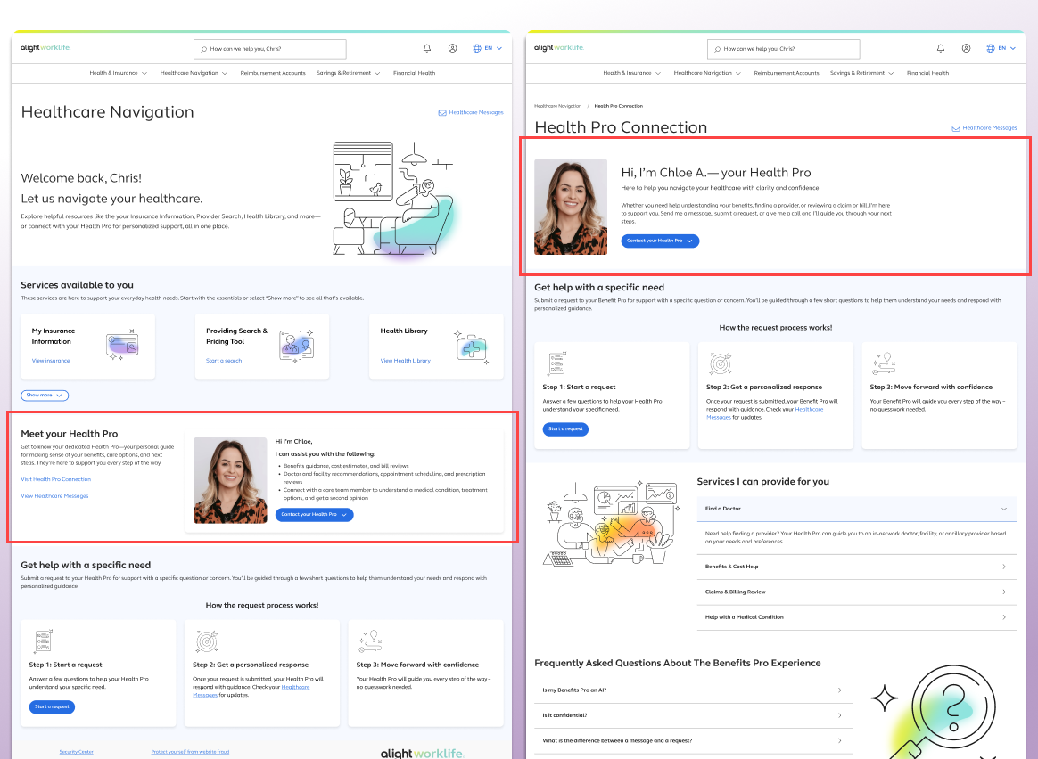
As Lead Product Designer, I was responsible for redesigning the Healthcare Navigation experience on the Alight platform, which offers both self-service tools—like a symptom checker, provider search, and health library—and access to a dedicated Health Pro for personalized healthcare support. The existing experience caused confusion among users, who were unclear about the roles of the Health Pro (assigned dedicated medical assistant) and Medical Ally (a registered nurse), misunderstood the asynchronous nature of communication, and were unaware of the different ways to access help. The landing page lacked clarity and failed to highlight the full spectrum of support options available, leading to missed opportunities for engagement and support.
To address these gaps, I led end-to-end design efforts including information architecture, exploration, prototyping, and final UI delivery. I collaborated closely with the VP of healthcare, product managers, engineers, and researchers to define a clear information hierarchy that distinguished between the landing page and the Health Pro interface. Working under tight deadlines driven by client obligations, I was able to produce test-ready designs within weeks of our initial workshop. This redesign not only improved clarity and usability but also aligned the product experience with its intended support model—building user trust and strengthening engagement with both self-service and professional healthcare guidance.
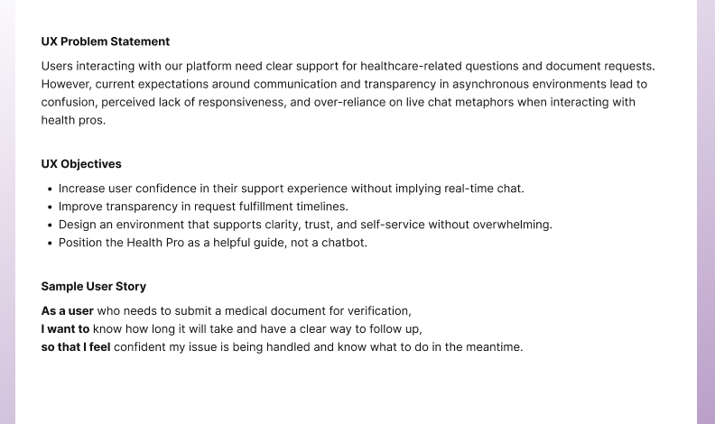
The Problem
Users interacting with the Healthcare Navigation experience were confused about the roles and availability of support resources, particularly the distinction between Health Pros and Medical Allies. The asynchronous communication model was often misinterpreted as live chat, leading to unmet expectations. Additionally, the landing page did not effectively communicate the full range of available self-service tools or methods of contacting a Health Pro. This lack of clarity reduced user engagement, created frustration, and undermined trust in the platform’s ability to support their healthcare needs. A redesign was necessary to improve understanding, streamline navigation, and promote informed use of both self-service and human-guided support options.
The Approach
To address the confusion around roles, expectations, and available tools within the Healthcare Navigation experience, I led a cross-functional design effort focused on redefining the platform’s information architecture and visual hierarchy. Starting with a strategic workshop, I partnered with stakeholders across product, development, research, and executive leadership to identify key pain points and opportunities for improvement.
After rapidly developing prototypes within a tight timeline, we conducted user testing to validate the clarity and effectiveness of the new designs. Feedback from testing directly informed refinements to content structure, terminology, and the overall flow between the Healthcare Navigation landing page and the Health Pro experience. My approach prioritized user clarity, trust, and guided discovery—ensuring that users could confidently navigate between self-service tools and personalized support.
The Results
Through 4+ rounds of user testing, we continuously refined the Healthcare Navigation experience based on direct feedback, ultimately validating the effectiveness of our design solutions. The final implementation resolved key areas of confusion, improved users’ understanding of Health Pro roles, and increased engagement with both human and self-service support options. Users expressed greater confidence in navigating their healthcare journey and clearly understood how and when to reach out for support.
Top Findings:
-
8/10 Participants looked through each major sections of the page. (6/8 specifically called out options to get help)
"So I guess I could make a request here [Start a request] in order to get help with finding a doctor for my healthcare, or I can just reach out to the healthcare itself [Contact your Health Pro] or call the 800 number."
"And then at the bottom is get help with a specific need. So this looks like we can do a request for a question or concern. But if I had knee pain, I'd probably go start with the health library."
-
7/10 participants stated the purpose of the page is to get information about your healthcare
"It's a central place to help get you started with your healthcare needs."
"It looks like a portal for customers to navigate their health needs. Everything they would need to understand their policy." -
3/10 participates stated the purpose of the page is to connect you with the correct healthcare resources.
"It's a navigation page. It connects you with helpful resources like insurance, a health library, the health pro. It gets you to the right places."
"It's kind of a one stop shop. It's got personalized information for me. It's like a dashboard sort of, only it's a way to navigate to different things having to do with my health care."
-
7/10 participants stated they did expect to click "Visit Health Pro Connection" to learn more about their Health Pro.
"Yeah it is. The button is pretty clear on what that means." -
2/10 participants stated the button label is confusing.
"I figured that's where I should go but why does it say connection? Could it just say learn more about your Health Pro?"
"This name doesn't really tell me I can learn more. It seems like maybe another place to message them but not get more information about a Health Pro."
-
9/10 participants stated the purpose of the page is to assist them with healthcare related services.
"You know, services I can provide cost benefits, claims help with claims, help with the medical condition. And then there's a bunch of FAQs at the bottom, so these are all the different things and it's kind of what I would expect."
"So this is exactly the information I would need to be able to get questions answered about my health stuff and more forward with specific requests." -
1 participant stated that they still felt unsure what all a Health Pro can do.
"It takes a while when you scan, scan down and I'm still not sure. It's got services they can provide for you, which is what I was looking for, but it's way at the bottom of the page. I think that needs to be moved up to the top, like the first thing you see, because that's, it answers some of the questions I did have about what Health Pro is."
-
8/10 participants stated the content on the page is not overwhelming.
"I think this is good. In fact, I wish there was a little bit more about how each of these things can help me."
"This is the exact amount that I need, it's not too overwhelming. There is a lot of like artwork or images which breaks up instead of it just being content or text. The icons or images are also a reflection of what it is that the topic is about. So these images help me navigate and make sure I'm at the right category, and it's not too wordy, and it has little bits of color throughout to make sure that's it's mot just one."
"Well, it's a lot of content, but I have to say that it's laid out really great. It's not too compact. It's got the necessary messages I could possibly want to look at right away. I can navigate out of this particular page if I need to. Then as we start getting down, we get into some of the clickable things which you're noticing the cool icons here." -
2/10 participants stated the page is too long.
"I'd rather not scroll so much because of my carpal tunnel, so just get rid of the icons. They're not really needed."
"There's a lot on here, a lot of content and if I'm in knee pain I just want to get to the answer fast."
Key Patterns
Setting Expectations
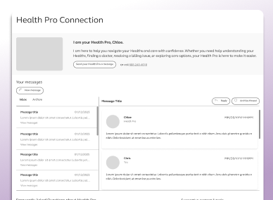
Placing the Health Pro image at the top of both the landing and subpage shaped user expectations in unintended ways. On the main landing page, its prominent placement led users to believe the entire experience was centered around the Health Pro. To support broader feature discovery, we deprioritized the Health Pro section on the landing page. However, on the dedicated Health Pro page, placing the image at the top aligned with user expectations and reinforced the page’s focus—an insight confirmed through user feedback.
Group Ways of Communication
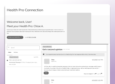
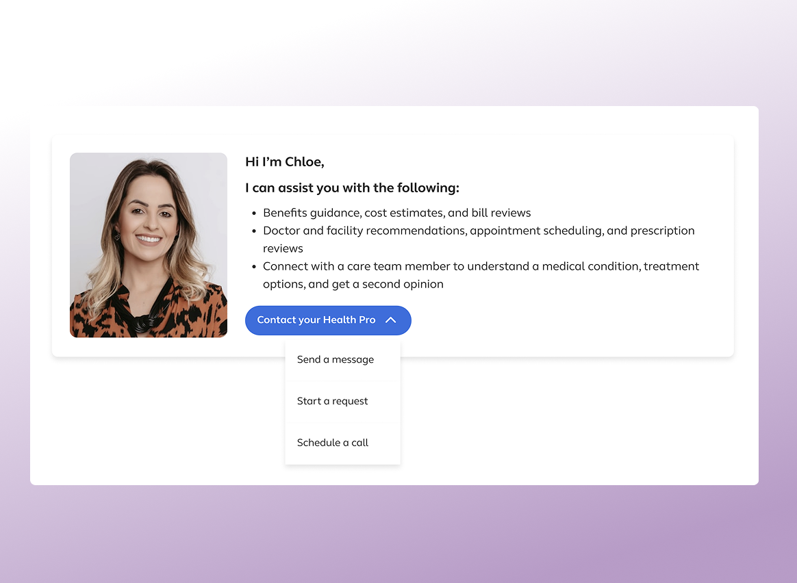
Users can contact their Health Pro in three ways: sending a message, starting a request, or scheduling a call. Initially, only "Send a message" was shown near the Health Pro, which caused confusion when other contact options appeared elsewhere. To improve clarity, we consolidated all communication methods into an overflow menu and tested the updated design. Users clearly understood the different options and how to access them.
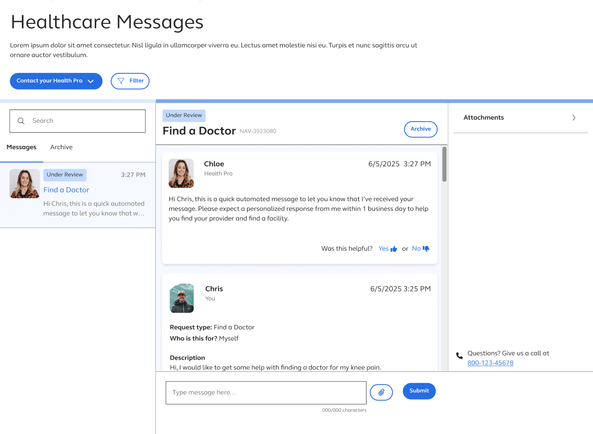
Leverage E-mail Design Patterns
To set accurate expectations and avoid confusion with live chat, we designed the communication experience to reflect asynchronous interactions. By incorporating familiar email-like patterns—such as timestamps, message statuses, structured layouts, and clear timeline indicators—we reinforced clarity and transparency for users.