Table of Contents
Financial Analystics Dashboard Design
My Role:
Lead Product Designer
User Researcher
Miranda A.Developer
Stephen K.
Product Manager
Jeff A.
Design System Designer
Meli M.Product Designer(s)
Daphne Z. , Maya F.Accessibility Designer
Bob J.Client:
Alight Solutions
Overview
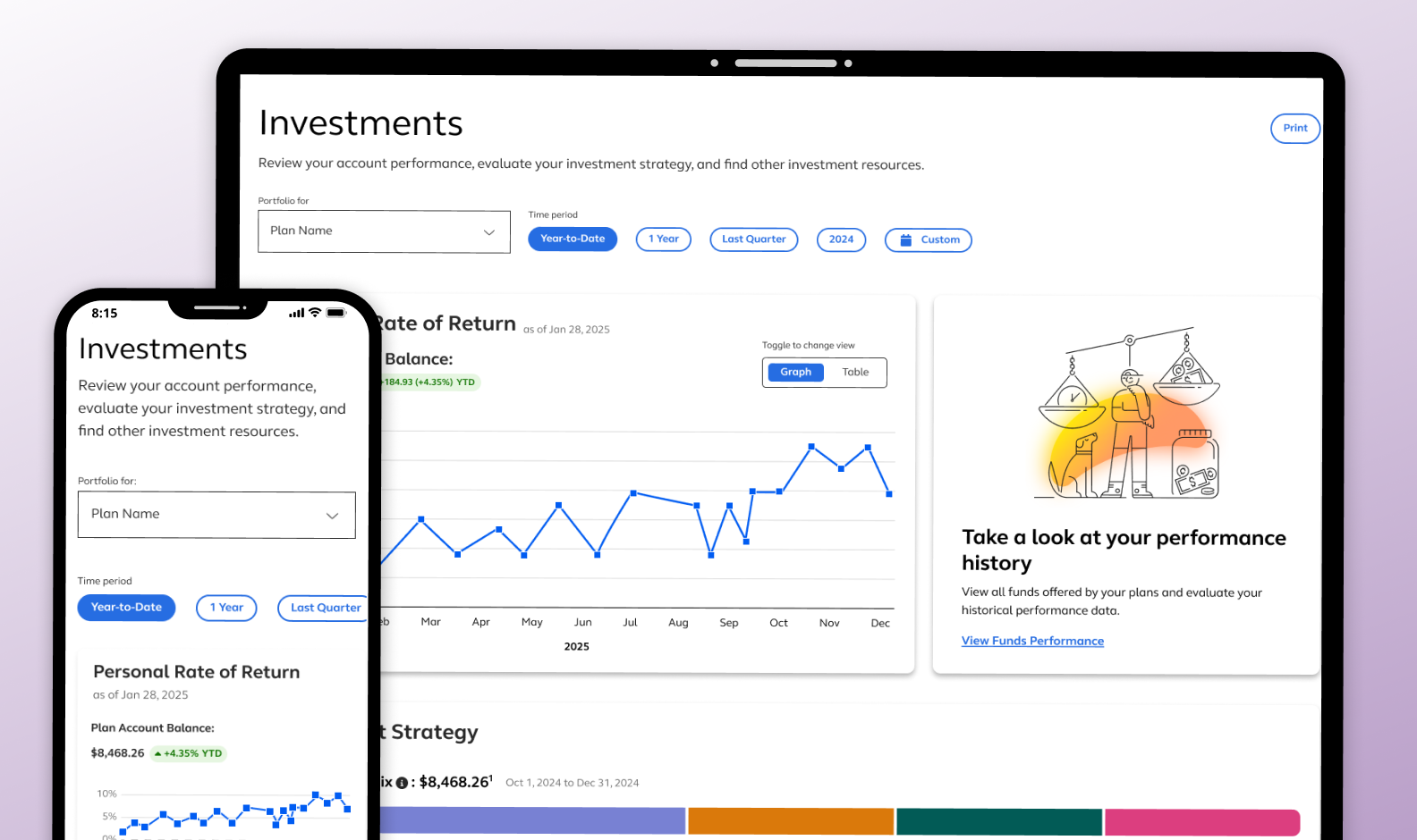
To help retain our primary client and support a $50 million contract renewal, we led a strategic redesign of the Investments and Fund Performance experience. Through a focused three-day design workshop with wealth product stakeholders, we identified key opportunities to enhance usability, modernize the interface, and improve access to critical financial data.
The redesign introduced an updated Investments Landing Page, a dedicated Fund Performance page, and new data cards to surface relevant insights. These solutions aligned with our financial brand aesthetic, followed our design system standards, and improved information clarity while preserving core functionality—enabling investors to more confidently navigate their portfolios and performance data.


The Problem
The existing Investments and Fund Performance experience lacked clarity and consistency. Users had difficulty accessing key financial insights, and the homepage didn’t support scalable or dynamic content. Leadership needed a refreshed experience that aligned with the company’s design system, improved usability, and supported a $50M client retention effort.
The Problem Statements
We identified a set of problem statements to better understand the challenges related to launching a scalable, user-centered Investments and Fund Performance experience.
- Investors couldn’t easily compare or monitor fund performance at a glance.
- The homepage lacked a unified framework for surfacing relevant investment data.
- Existing components weren’t scalable for dynamic use cases across product teams.
- Design inconsistencies made the experience feel fragmented and difficult to maintain.
The Approach
To address these challenges, I led a three-day design workshop with wealth product owners to identify user pain points and define core objectives. We aligned on the need to modernize the interface, improve scannability, and reduce cognitive load. Based on this input, I created a flexible, dynamic data card system that could surface high-priority insights on the homepage.
I also introduced a redesigned Investments Landing Page and separated Fund Performance into its own dedicated page. These experiences were designed with scalability in mind — enabling personalization, maintaining design system consistency, and improving performance. I conducted iterative testing and incorporated both user and stakeholder feedback to ensure the solution delivered clarity and confidence.
The Results
The new design increased visibility into fund performance, reduced cognitive load, and enabled users to personalize their homepage view. Stakeholder feedback was positive, and the redesign contributed to the successful renewal of a $50 million contract with the primary client.

The Key Patterns
To enhance usability and consistency, I applied key UI patterns aligned with our design system. These patterns improved clarity, supported user decision-making, and ensured the interface remained intuitive, scalable, and functional across the Investments and Fund Performance experience.
Data card structure
A key UI pattern was the development of flexible, size-consistent data cards. I designed a reusable template that adapts to various content types and allows other product teams to surface overview data on the homepage while maintaining design system alignment.
Accessible Data Visualization:
I also introduced an accessible comparison table that paired visualizations with labeled data tables, used high-contrast colors, and followed accessibility guidelines. Interaction standards were documented to ensure consistent, inclusive use across products.
Reduce Information Density:
To manage complex data, I used expand/collapse functionality for dense graphs and added labeled tooltips to data cards. These patterns maintained clarity and accessibility while allowing users to scan key insights or explore details as needed.
Project Feedback