1 Minute Summary
1 Minute Summary
the problem
Alight's Healthcare Navigation platform had a trust problem. Users couldn't distinguish between service support types, carried false assumptions about how messaging worked, and consistently overlooked self-service tools that already existed. With client contracts tied directly to feature visibility, there was no room to negotiate the timeline. The redesign had to ship in three months.
my approach
Before designing anything, I grounded myself in the product's history to avoid repeating decisions that had already been tried and discarded. From there, I led a UX audit, design strategy, information architecture, and full UI execution that surfaced the central problem: the landing page was trying to serve two competing user intentions at the same time, and failing both. From that point, I ran fast, focused usability testing sessions, iterating until the core pain points were resolved and success criteria were met.
The outcome
Across four rounds of moderated usability testing, 8 out of 10 participants navigated the full page and identified multiple support pathways without any prompting. This indicated that the confusion driving the original trust problem had been resolved. The final deliverables included three new components and a fully documented developer handoff covering two landing pages and one messaging environment page, all designed responsively and built to accessibility standards.
Want the full story?
The sections below dives deeper into research, design decisions, iterations, and learnings.
Overview
My Role
Product Design Lead
Design Strategy, Visual Design, Rapid Prototyping
project type
Redesign
team
1 Designer
1 PM
1 Engineers
4 other stakeholders
duration & status
3 months, Launched Q4 2025
company
alight solutions
demo
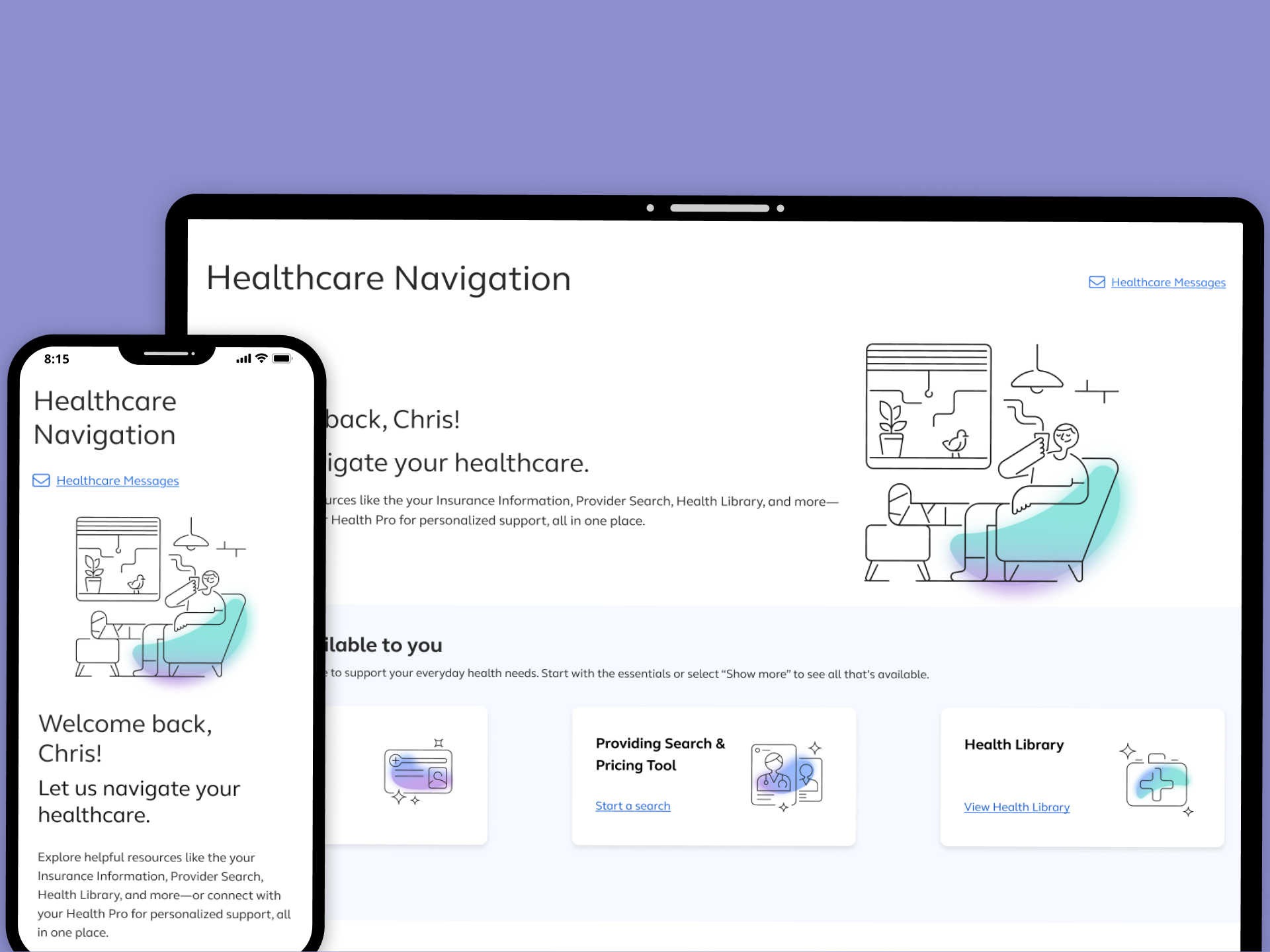
Healthcare navigation: one place to manage your healthcare journey, with both digital tools and real guidance available when you need them
About the product
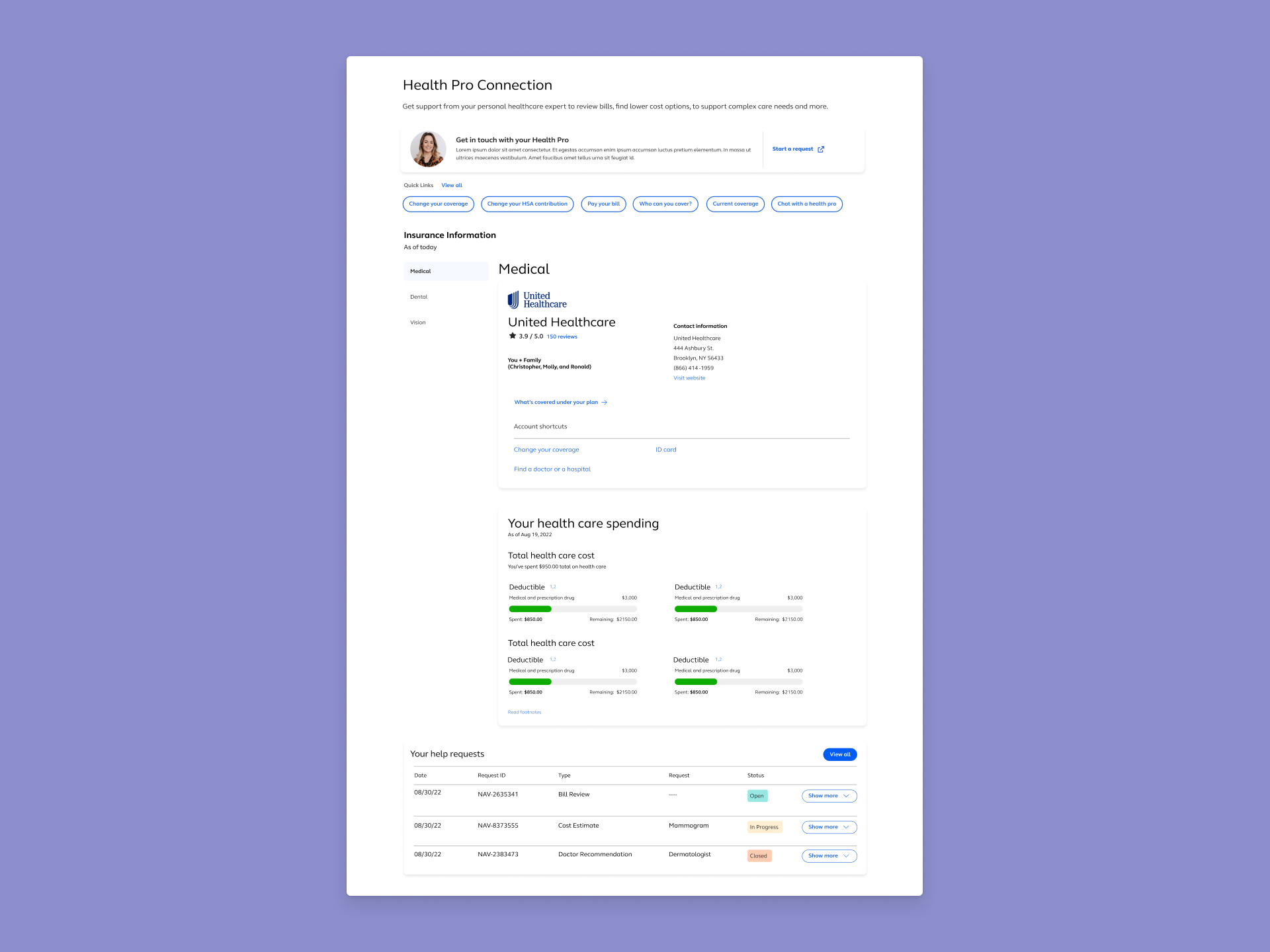
Healthcare Navigation is a core feature within the Alight benefits platform. It gives users access to self-service tools such as: provider search, a health library, symptom checkers — alongside human-led support through personally assigned Health Pros.
Why this work mattered now
The experience had accumulated problems over time such as overlapping features, inconsistent terminology, and a page structure that no longer reflected how users actually sought help. As the platform's user base grew and healthcare needs became more complex, the gap between what the product offered and what users could find became impossible to ignore. Engagement with self-service tools was low.Support volume was higher than it should have been. And the Health Pro model wasn't landing the way it was meant to.
drivers for the redesign
Three forces made this work time-sensitive. First, user behavior: testing and support data consistently showed confusion at the navigation layer, with users misreading features, missing tools, and forming inaccurate expectations about communication.Second, business performance: low self-service engagement meant the platform wasn't demonstrating ROI on features that had already been built.Third, client commitments: contractual expectations tied to feature visibility and engagement created a hard deadline that compressed the entire design and testing cycle to under three months.
Problem
I first had to be precise about where the experience was failing and what it was actually costing.
key usability issues
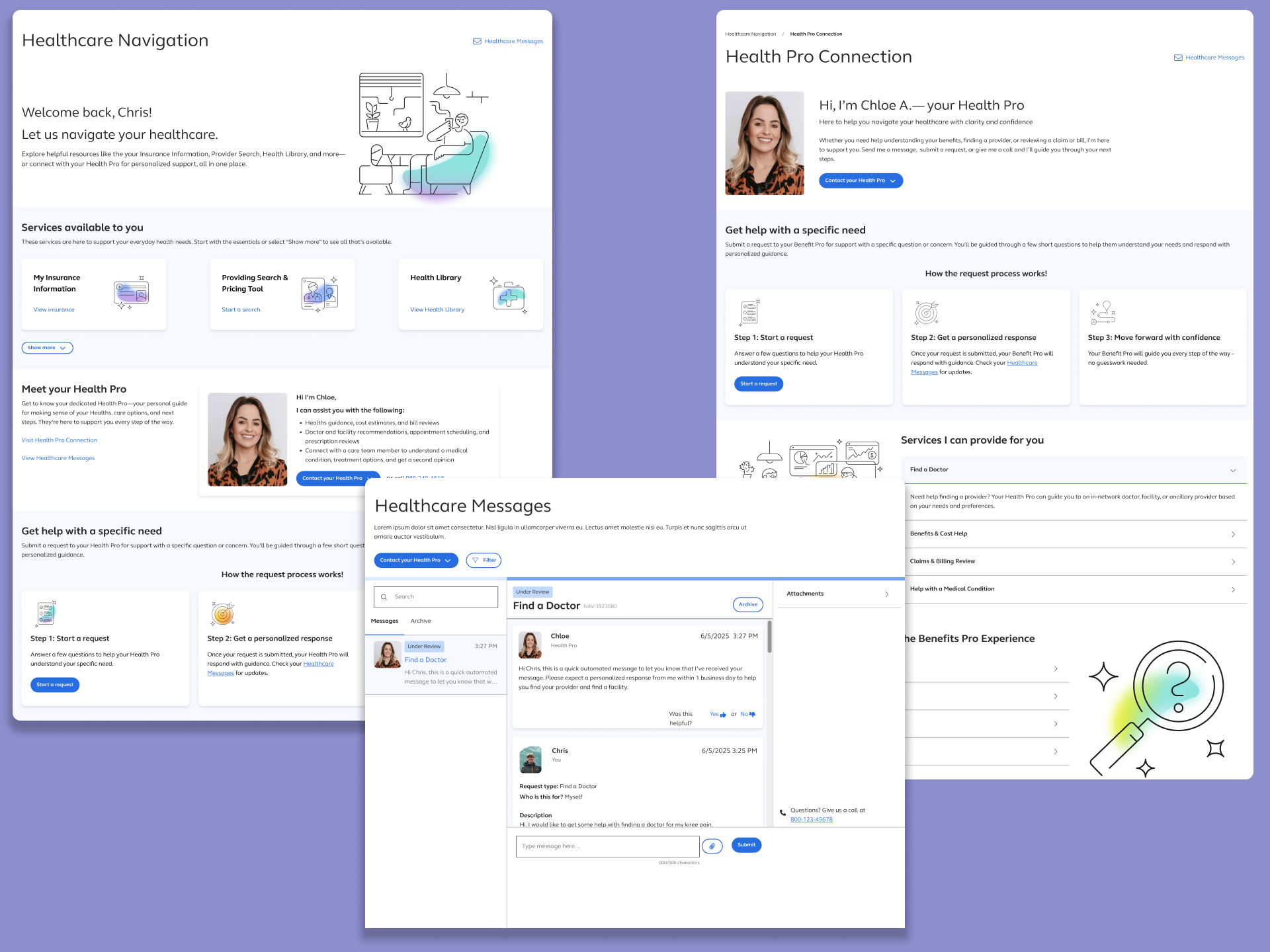
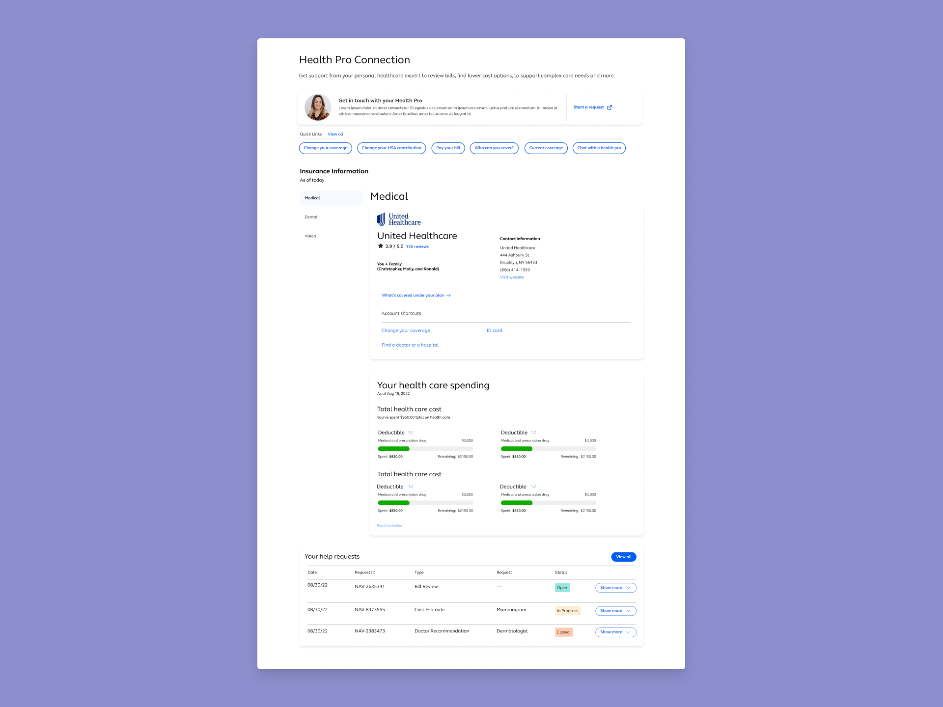
The landing page had a structural problem at its core: it was organized around the product's features, not around how users think about getting help. The Health Pro — a premium, personalized service — dominated the visual hierarchy, while self-service tools were buried in a way that made them feel secondary or optional. Users arrived looking for direction and left without finding it.
What we saw in the evidence
Support tickets, stakeholder feedback, and early usability sessions told a
consistent story. Users were
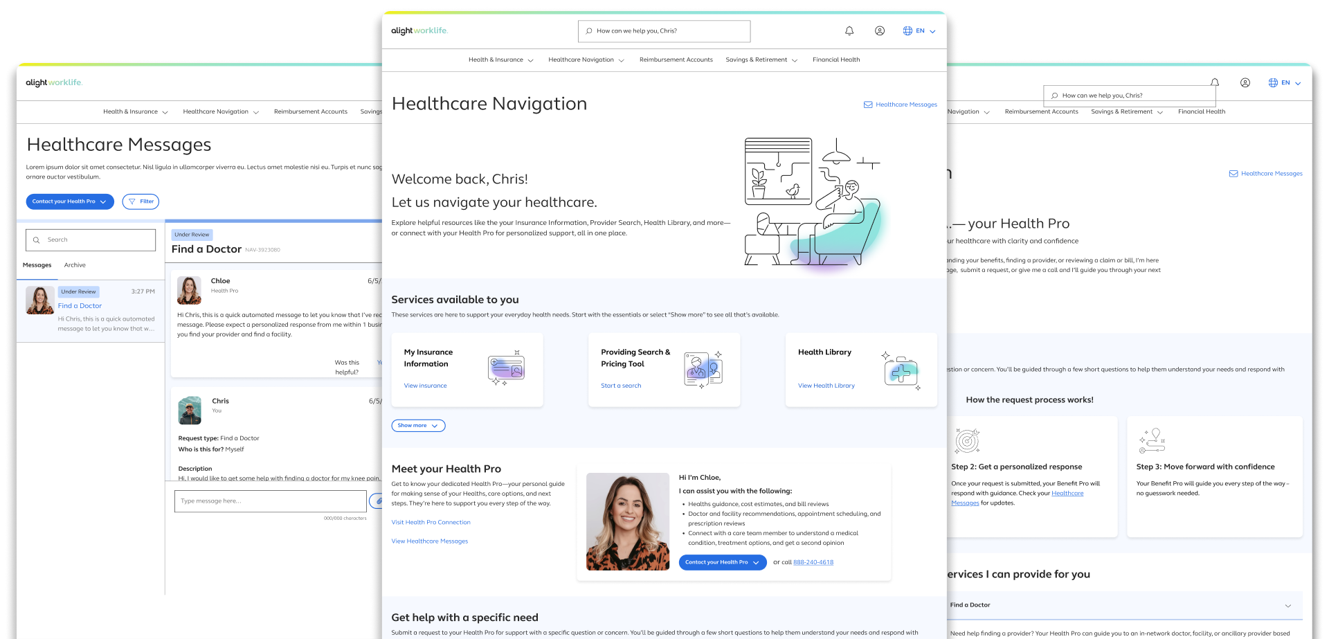
misreading the messaging interface as a live chat and when responses didn't come immediately, trust
dropped. Self-service tools like the symptom checker and provider search went largely unused, not
because users didn't want them, but because they never surfaced in a way that felt relevant. And the
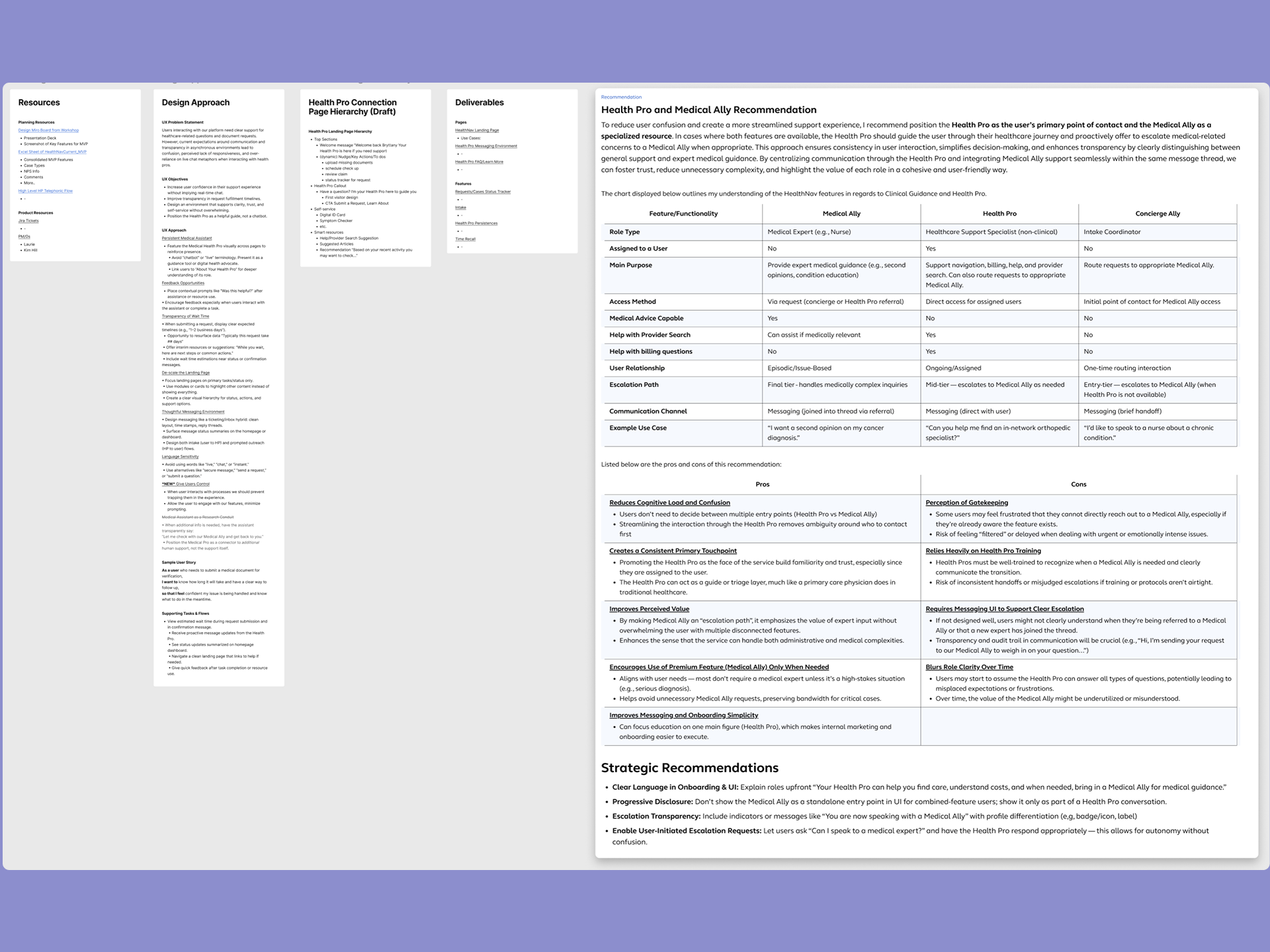
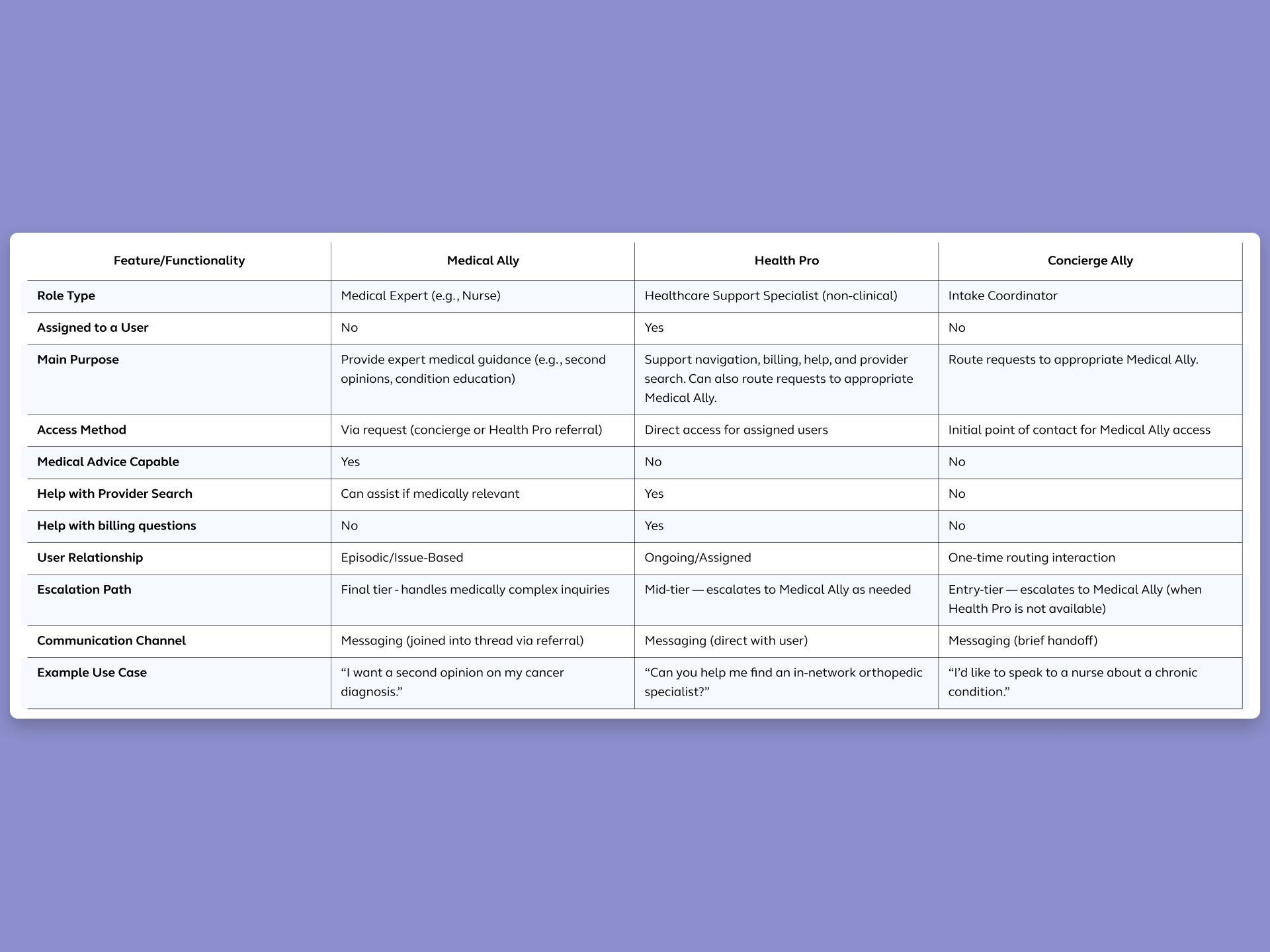
distinction between Health Pros and Medical Allies, two different roles with different functions, was
invisible in the interface.
These weren't isolated complaints. Confusion at the navigation layer created downstream
pressure on
support teams, reduced engagement with features the business had invested in building, and created a
perception that the platform was harder to navigate than going direct.
what users were struggling with
Users arrived on the page without a clear mental model of what it was for. They didn't know whether they were in a place to find information, send a message, search for a doctor, or do all of the above. When everything appears equally weighted, nothing feels clearly actionable. Users defaulted to the most familiar option: calling support. Rather than engaging with tools that could have resolved their need faster.

- Health Pro Callout -
- Quick Links Section -
- Insurance Information -
- Messaging Feature (Your Help Request) -
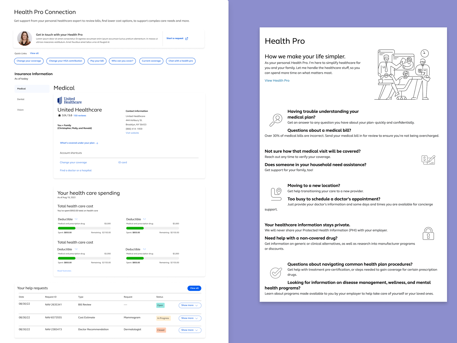

- Misleading Title -
- Merge Features -
- No Entry Link To Health Pro Landing Page -
- Messaging Feature Located At The Bottom Of Page -
Guardrails
Establishing guardrails is what makes it possible to find solutions that can actually ship on time.
Goals for this project
- User: Users needed to clearly understand the difference between Health Pros and Medical Allies, know what to expect when they sent a message and when they'd hear back, and be able to find and use self-service tools without hunting for them.
- Business:The business needed the Health Pro model to feel valuable and prominent without overshadowing the self-service features that clients expected to see performing. Reducing confusion-related support inquiries and increasing self-service engagement were both tied to demonstrable platform ROI.
Approach
Until the hierarchy was right, no amount of visual refinement would resolve what users were experiencing.
Separate two competing mental models before touching the interface
The landing page was simultaneously trying to be a hub for self-service tools and a personal gateway to an assigned health advisor. Those are different user intentions, and they need different visual and structural treatment. I restructured the page to give each a clear, distinct position — not by removing either, but by organizing them so users could immediately recognize what type of help they were looking at and choose accordingly.
Rebalance the hierarchy without diminishing the Health Pro
The business had a legitimate interest in keeping the Health Pro visible and prominent. Users had a legitimate need to find self-service tools without scrolling past a feature they weren't ready to engage with. The solution wasn't to choose one priority over the other — it was to redesign the hierarchy so that each element occupied the right position relative to how users naturally move through the page. The Health Pro shifted from dominant visual anchor to a clear, accessible entry point. Self-service tools moved into primary discoverability. Neither was buried. Both became more findable.
Design the expectation, not just the interface
The asynchronous messaging confusion was never going to be solved by a UI update alone. Users were forming expectations based on visual patterns that felt like live chat, and those expectations weren't matching the reality of the system. Since we couldn't change the underlying messaging architecture, we redesigned the communication layer around it — introducing email-inspired patterns, explicit timestamps, and clear status language that made asynchronous communication feel intentional and trustworthy rather than broken or unresponsive.
Test structure, not preference
Across four rounds of moderated usability testing, the research was
focused on comprehension and decision-making — not aesthetic preference. Could users identify
their options without prompting? Did they understand what would happen after they sent a message?
Could they find a self-service tool relevant to their need? Each testing round validated a
structural decision and informed the next iteration. By the time the design was final, every major
choice had evidence behind it.
I partnered with the research team throughout, contributing to test planning, observing sessions,
and translating findings directly into design iterations. The speed of the timeline made that
partnership non-negotiable — there was no room for a handoff-and-wait cycle.
Results
Four rounds of moderated usability testing produced clear, consistent findings across the primary problem areas.
8 out of 10 participants navigated through all major sections of the redesigned page and identified multiple pathways to support without prompting.
"So I guess I could make a request here to get help with finding a doctor, or I can just reach out to my Health Pro directly, or call the 800 number. And then at the bottom — get help with a specific need."
Indication
The restructured hierarchy gave users a map of the page before they had to make a decision. When users can articulate their options unprompted, the structure is doing its job.
Communication expectations shifted
Users who tested the message center understood — without explicit instruction — that they were
entering
an asynchronous experience. The email-inspired patterns, timestamps, and status indicators did the
work
that content alone couldn't. Frustration around response timing dropped out of the findings entirely
by
round three.
Directional business impact: Stakeholder feedback following testing confirmed that
the redesign
addressed the visibility and engagement gaps that had been flagged in client conversations.
Self-service
tools that had previously gone unnoticed were being found and used. The design moved from a point of
internal debate to a shared, evidence-backed direction.
Key Patterns
The goal of this redesign wasn't just to fix the current experience, it was to introduce patterns that could travel across the platform as it continued to evolve.
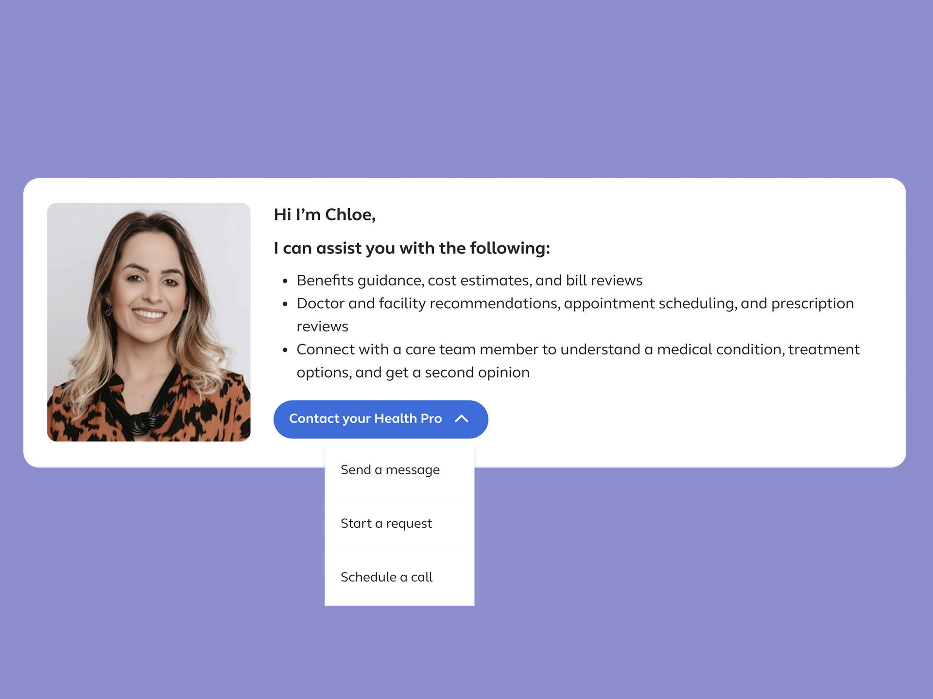
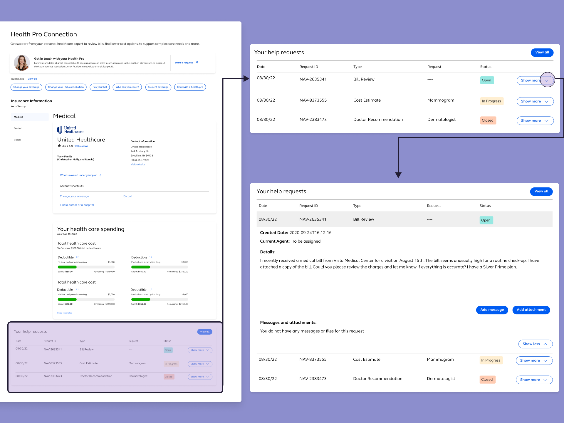
Overflow Menu for Contact Options
Multiple ways to reach a Health Pro — message, request, call —
were consolidated into a single, scannable overflow menu.
Show more details
Hide more details
Overflow Menu for Contact Options
Multiple ways to reach a Health Pro — message, request, call — were consolidated into a single, scannable overflow menu.
Show more details Hide more details
By merging the different way to contact a Health Pro into a dropdown, this reduced visual clutter on the landing page, eliminated the need for users to evalirate which contact method to use before they were ready, and created a scalable pattern for any future contact scenario added to the platform.
Tradeoff navigated: Consolidation always risks hiding options. I had to ensure during testing, that we focus on validating whether or not users would discover the overflow menu and understand it as a full set of choices rather than a single action. This concept held up across all four rounds.
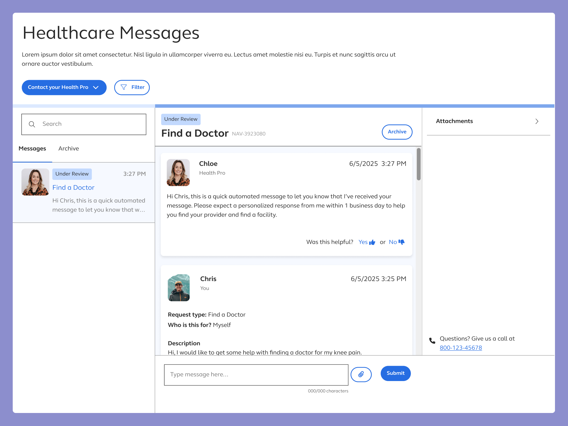
E-mail Inspired Message Center
Applying asynchronous design conventions (timestamps, message
status indicators, thread-based organization) to the new message center gave users a familiar
coginative frame for an unfamiliar system.
Show more details
Hide more details
E-mail Inspired Message Center
Applying asynchronous design conventions (timestamps, message status indicators, thread-based organization) to the new message center gave users a familiar coginative frame for an unfamiliar system.
Show more details Hide more details
Users stopped expecting live chat not because we told them it wasn't live, but because the interface no longer looked like it was.
Tradeoff navigated: The risk of implementing this design was making the message center feel formal or transactional in context where users want to feel supported. Microcopy and visual warmth offset that without sacrificing the structural clarity the pattern provided.
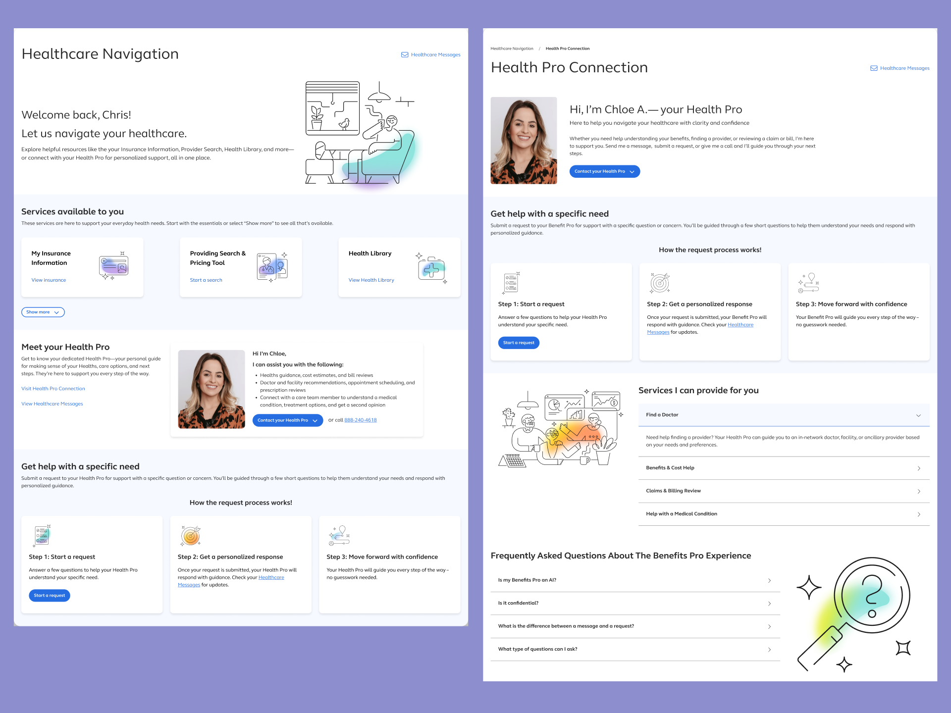
Page-level Content Hierarchy
Visually and structurally differentiating the Healthcare
Navigation landing page from Health Pro detail page resolced the most persistent source of user
confusion, not knowing where they were and the page's purpose.
Show more details
Hide more details
Page-level Content Hierarchy
Visually and structurally differentiating the Healthcare Navigation landing page from Health Pro detail page resolced the most persistent source of user confusion, not knowing where they were and the page's purpose.
Show more details Hide more details
Clear hierarchy meant users could orient themselves immediately and make decisions about where to go next without reading everything on the page.
Tradeoff navigated: Stronger hierarchy means making choices about what gets deprioritized. The decision to move the Health Pro from dominant anchor to entry point was the most contested design call in the project. Also the one most consistenly validated by testing.
Demo
Thank you for reading!
Contents
don't be a stranger!
Let's collaborate and create something amazing!