1 Minute Summary
1 Minute Summary
the problem
Participants did not have a dedicated way to understand their non-qualified installment payments. Installment information was fragmenred across systems and different to interpret, making it unclear which installment streams were active, where participants were within a payment schedule, and when their next payment would occur. As installment configurations grew more complex, this gap created confusion and increased reliance on support teams.
my approach
Early collaboration with stakeholders to synthesize their input was a important first step to document the project's guardrails. Conversations focused on defining a clear information hierarchy around participants priorities, structuring content by plan and class year scalability, and making intentional scope trade offs to deliver a test-ready concept.
The outcome
Within 3 weeks, I was able to create test-ready installment payment experience with clear visibility into active installment streams and remaining payments. Designed an expandable structure supporting detail without overwhelming users and defined backlog of future enhancements grounded in validated needs.
Want the full story?
The sections below dives deeper into research, design decisions, iterations, and learnings.
Opportunity
My Role
Product Design Lead
Design Strategy, Visual Design, Rapid Prototyping
project type
Net New Concept
team
1 Designer
1 PM
2 other stakeholders
duration & status
3 weeks, Test Ready
company
alight solutions
demo
Opportunity to define a dedicated experience that could translate complex installment logic into something participants could confidently understand and act on.
About the product
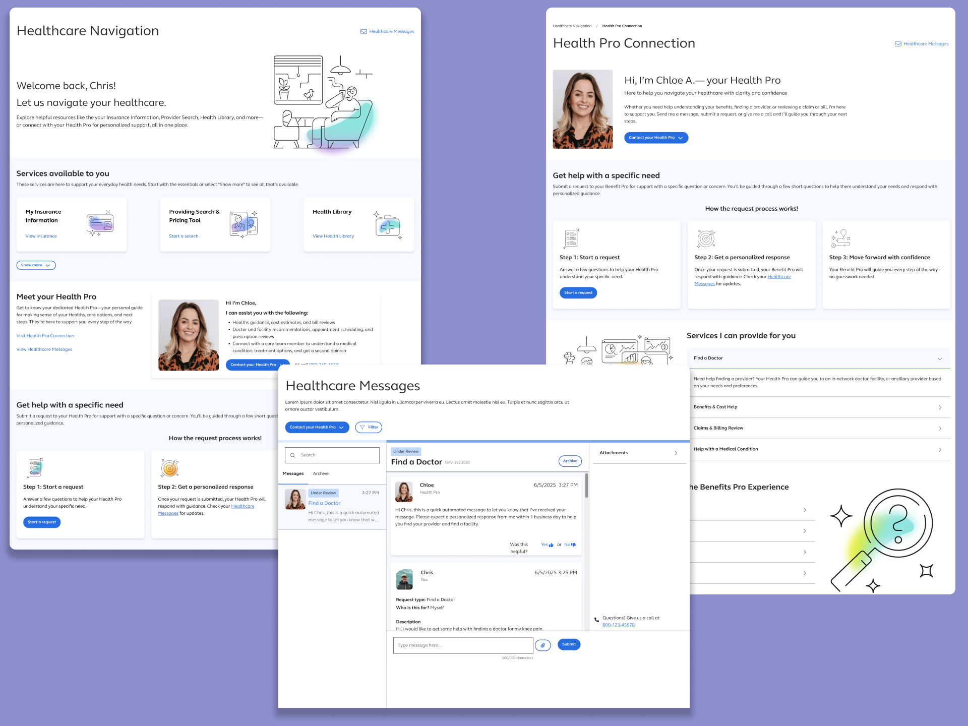
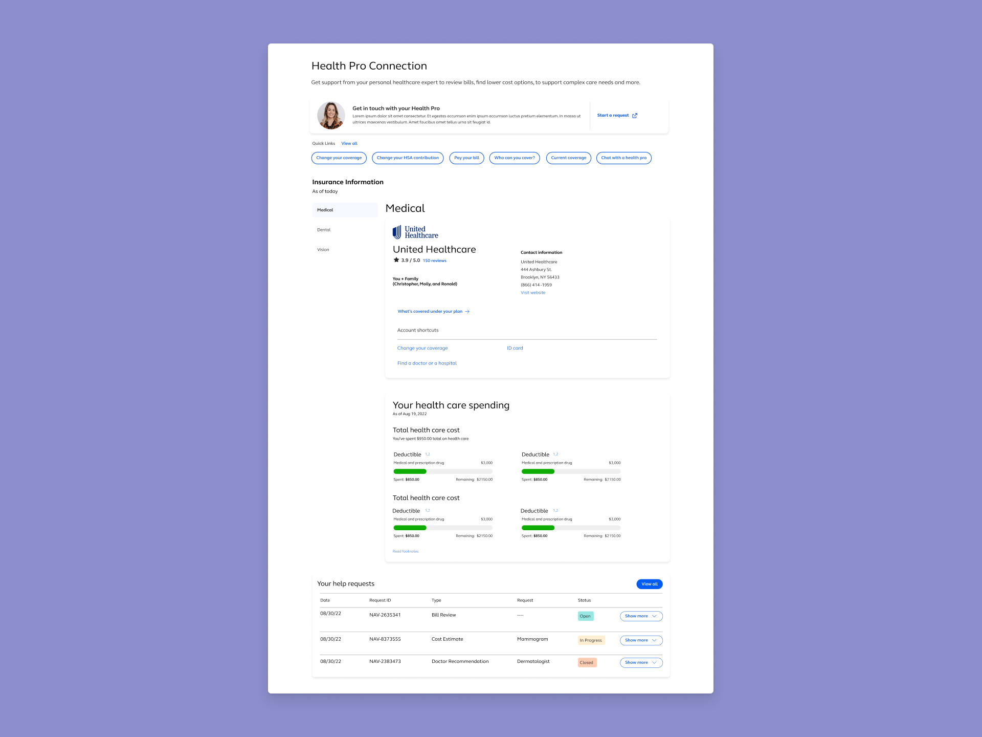
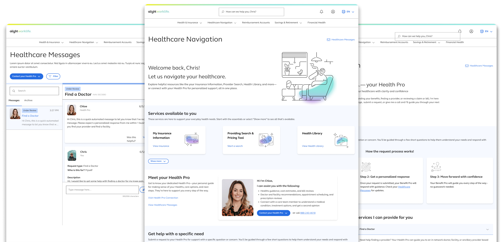
Healthcare Navigation is a core feature within the Alight benefits platform. It gives users access to self-service tools such as: provider search, a health library, symptom checkers — alongside human-led support through personally assigned Health Pros.
Bringing Structure and Context to Installment Payments
As non-qualified plans introducted more flexible installment options, participants were left without a clear way to understand how their payments were structured over time. Information existed, but it was fragmented, inconsistent, and often optimized for internal operations rather than participant comprehension.
Gaps Identified
After auditing the current active installment payment experience, I identified the following gaps:
- No centralized view of active installment streams across plans.
- Lack of clarity around progress within a stream (how many payments remain).
- Inconsistent visibility into processed vs. upcoming payments.
- Over-reliance on dense tables and transactional records without meaning hierarchy.
These gaps made it difficult for participants to answer basic questions about their installments without external support.
Why existing solutions fell short
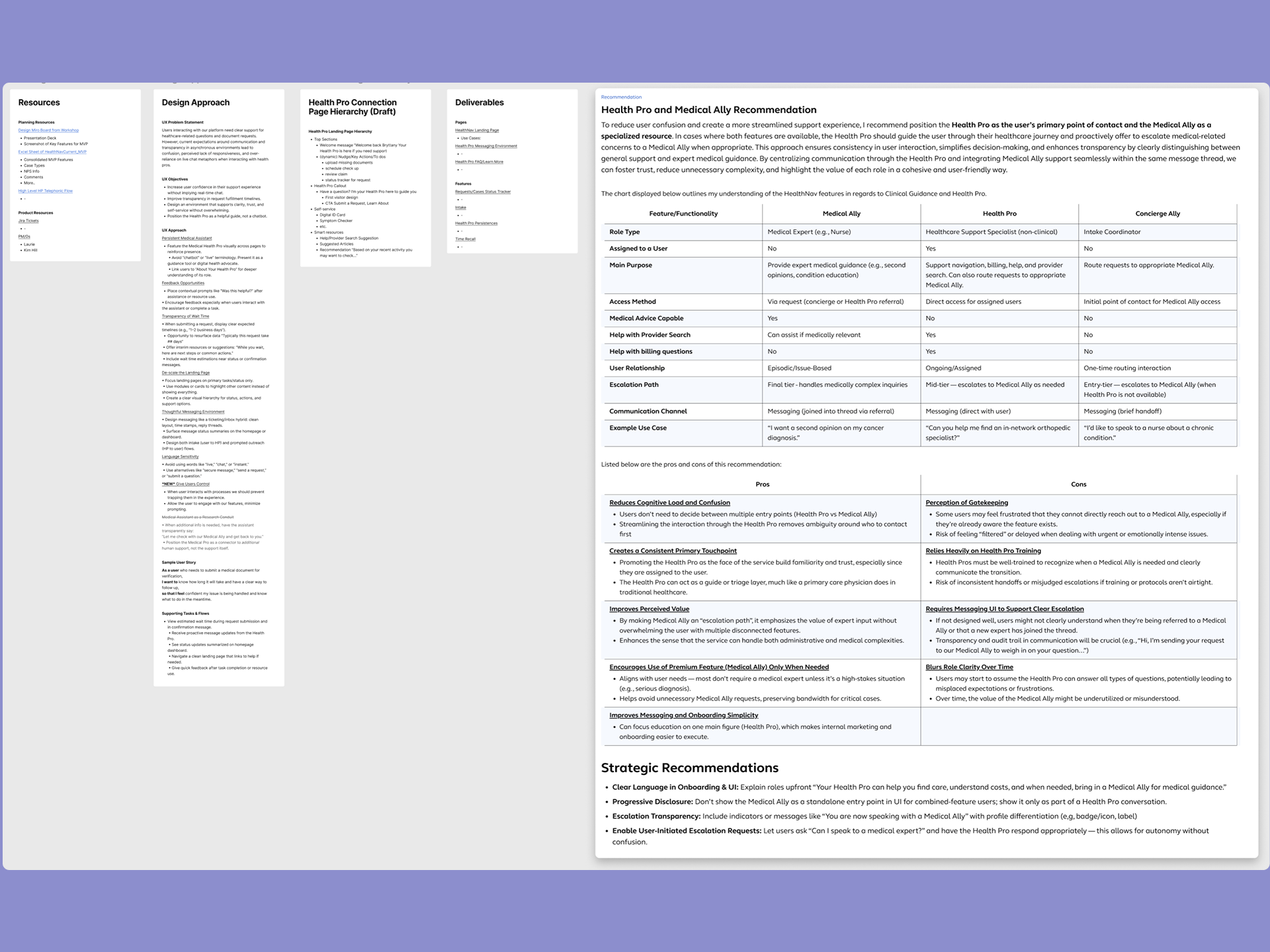
Existing surfaces focused on individual transactions rather than the installment journey as a whole. Payments were displayed as isolated events, without context around sequencing, remaining installments, or future expectations. WHile this approach satisfied record-keeping needs, it failed to support participant understanding. Important to note as well that installment configurations becomes more complex across plans and class years
Who this feature is for
This experience is designed for participants enrolled in non-qualified plans who recieve payments through installment streams. These users need a clear, self-serve way to understand which installments are active, where they are in each schedule, and what to expect next — without requiring deep financial knowledge or assistance from support teams.
6 High Prioritized Use Cases
- Use Case #1:
- Plan + 1 Class Year + Group Installments
- Use Case #2:
- Plan + 1 Class Year + 2 Group Installments
- Use Case #3:
- Plan + 2 Class Year + 1+ Group Installments
- Use Case #4:
- Plan + No Class Years + 1+ Group Installments
- Use Case #5:
- Plan + 1 Class Year + Ungrouped Installments
- Use Case #6:
- Plan + No Class Year + Ungrouped Installments
Problem Framing
Defining the core challenge and validating early assumptions
core problem statement
Participants receiving non-qualified installment payments lack a clear, participant-friendly way to understand their installment streams over time. While payment data exists, it is presented in a fragmented and transactional manner that does not communicate which installment streams are active, how far along participants are in stream, or when to expect future payments. As installment configurations increase in complexity, this lack of content creates confusion and undermines participant confidence.
Assumptions and Hypotheses
Because this was a net-new experience, early decisions were guided by a set of working assumptions about participant needs and behaviors. These assumptions helped shape initial structure and prioritization, while the hypotheses defined what we believed would improve clarity and confidence if validated through testing. Together they proved a framework for designing with intent rather than opinion.
- Assumptions
-
- Participants primarily want to understand status and progress, not underlying financial mechanics
- Viewing installment payments as a sequence over time is more meaningful than viewing isolated transactions
- Participants need different levels of detail depending on context, requring a progressive disclosure approach
- A single, centralized experience would reduce confusion and reliance on support channels
- Hypotheses
-
- If participants can see which installment streams are active and how many payments remain, they will feel more confident navigating their payments
- If processed and upcoming payments are clearly distinguished, participants will better understand timming and expectations
- If installment information is grouped by plan and class year, participants will be able to orient themselves more quickly
- If details are available on demand rather than upfront, participants will be less likely to feel overwhelmed

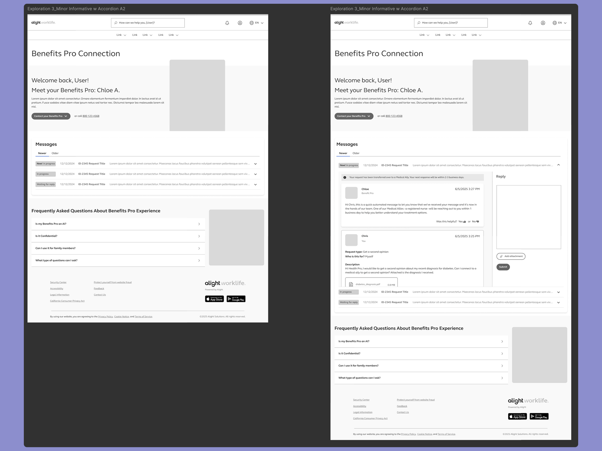
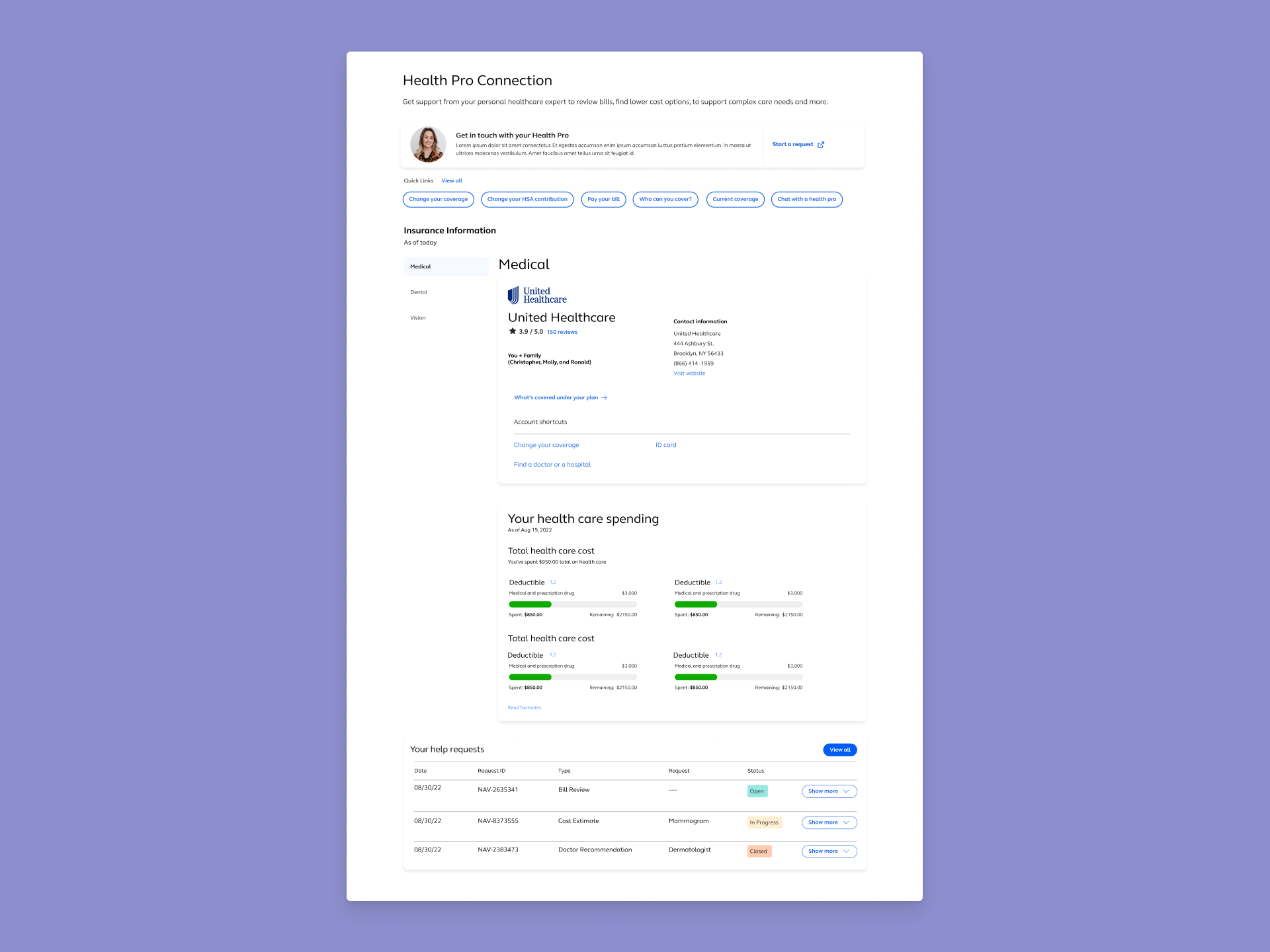
- Health Pro Callout -
- Quick Links Section -
- Insurance Information -
- Messaging Feature (Your Help Request) -
Goals
Aligning on what success would look like for both participants and the platform
- User Goals
- The experience was designed to help participants quickly understand which installments are active, where they are within each schedule, and what to expect next. By clearly distinguishing processed payments from upcoming ones and surfacing progress within a stream, participants can confidently navigate their installment information without needing external support or deep financial knowledge.
- Platform Goals
- Reduce participant confusion while establishing a scalable foundation for presenting installment data across plans and class years. The solution needed to support consistent installment logic, accommodate future complexity, and provide a structure that could evolve over time without requiring significant rework.
- Design Principles Guiding Decisions
-
Decisions were grounded in usability best practices including:
- Prioritizing orientation before detail
- Focusing on progress over isolated transactions
- Using progressove disclosure to manage complexity
- Designing for scale to ensure the experience supports platform growth
Experience Flow
guiding participants from orientation to understanding
User Journey
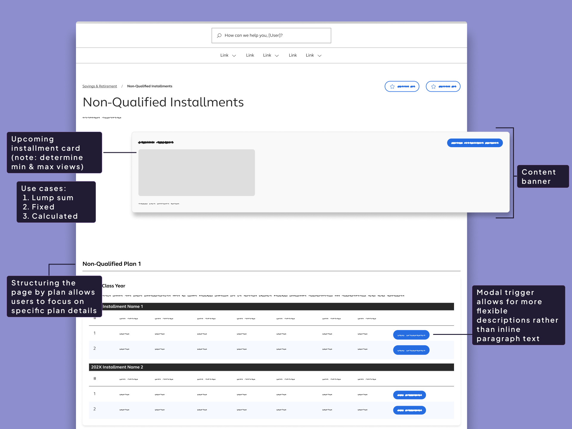
Participants begin the experience by narrowing their view using the Plan and Class year filters at the top of the page. These controls allow them to quickly focus on the installment streams that are relevant to their situation. Once filtered, the pare presents content grouped by plan, followed by class-year cards that organize installment information into manageable sections.
Within each class-year card, participants can expand accordions to view installment streams and payment activity over time. This structure allows them to scan high-level information first, such as whether a stream is active and how many payments remain, before choosing to engage with more detailed payment history or upcoming schedules. The experience supports quick orientation while enabling deeper exploration only when needed.
Filter and Focus
Participants begin by selection a Plan and Class year, narrowing the experience to the installment streams that apply to them.
Orient to active streams
The page surfaces installment activity grouped by plan, allowing participants to quickly see which streams are active and how payments remain.
Review payment status and timing
Within each class-year section, participants scan processed and upcoming payments to understand what has already occurred and when the next payment will run.
Expand for details as needed
Participants use accordions to access additional payment details without losing high-level context, engaging with deeper information only when necessary.
- Key Moments
-
- Initial Orientation: Participants immediately understand which plans and class years contain installment activity
- Progress Awareness: Visual cues and sequencing communicate where participants are within each installment stream and how many payments remain
- Timing Clarity: Clear differentiation between processed and upcoming payments helps participants anticipate what will happen next
- Controlled Detail: Accordions allow participants to access additional information without overwhelming the page or obscuring high-level context
- Edge Cases Considered
-
- Multiple Concurrent Installment Streams: Participants may have several active streams across different plans or class years
- Mixed Payment Types: Installments, partial distributions, and lump sums can appear within the same plan history
- Fixed vs. Calculated Installments Pending payments may or may not have known amounts at the time of display
- Paused or Canceled Installments: Streams may temporarily stop or convert to a lump sum whil preserving payment history
- Election Changes Over Time: Future payments may reflect new rules while previously processed payments remain unchanged
Key Features
Features that helped participants quickly understand their installment payments while supporting the complexity of non-qualified plans
Each feature was designed to reinforce orientation, reduce cognitive load, and scale across plans, class years, and installment configurations without introducting unnecessary friction.
- Plan and Class Year Filters
- Allow participants to quickly narrow the experience to relevant installment streams and reduce visual noise when multiple plans are present.
- Plan-Based Content Sections
- Organize installment information by plan, providing clear context and helping participants understand how payments relate to specific elections.
- Class Year Cards With Accordion Groups
- Break installment activity into manageable segments, enabling users to scan high-level progress before choosing to explore details.
- Installment Progress Indicators
- Clearly communicate how many payments have been completed and how many remain within each installment stream.
- Processed And Upcoming Payment Visibility
- Distinguish between completed and scheduled payments so participants can easily understand timing and expectations.
- Toggleable Detail Visibility
- Enable participants to show or hide accordion details based on their comfort level, supporting both quick scanning and deeper review.
Validation Plan
Confirming clarity, confidence, and scalability through testing
Because this was a net-new experience, validation focused on ensuring participants could accurately interpret installment information without guidance. The goal of testing is to confirm the concept supports the core user needs: identifying active streams, understanding progress, and anticipating the next payment. While also validating that the structure scales across common and edge-case configurations.
How I Would Test This
- Moderated Usability Test
- with participants who have installment payments (or close proxies), using realistic scenarios such as:
- “Which installment streams are currently active?”
- “How many payments do you have remaining in this stream?”
- “When was your last payment processed and when is your next one?”
- “Find the payment that was paused/canceled and explain what happens next.”
- Scenario-based Comprehension Checks
- Where participants explain what they believe is happening (great for validating confidence and reducing misinterpretation)
- Accessibility Review
- Keyboard navigation for accordion behavior, focus states, screen reader labels for installment progress and statuses
- Stakeholder/SME Review
- Confirm accuracy of labels, statuses, and the phrasing of fixed vs. calculated footnotes
- A/B or Preference Testing (Optional)
- For layout variants, such as accordion default state (open vs closed) or placement of progress indicators.
What I'd Measure
- Task Success Rate
- Measure the four core needs: active streams, progress/remaining, processed payments, next payment date
- Time On Task
- Measure time in locating “next payment” and “payments remaining”
- Comprehension Accuracy
- Can the participant correctly interpret fixed vs calculated payments, paused/canceled states, and what counts as “processed”?
- Confidence Rating
- Measure confident levels after each task (e.g., 1–5: “How confident are you that you understood your installment status?”)
- Error Patterns
- Determine where participants misread status, confuse plan vs class year, or assume amounts are final when calculated
Risks To Validate
- Participants Misinterpret Progress
- For example: Confusing “2 of 10” as remaining vs completed
- Confusion Between Grouping Levels
- If there is confusion between Plan vs Class Year vs account group/stream
- Calculated Installments Create Uncertainty
- When gross/net is blank—users may assume missing data is an error
- Over-Scanning vs Over-Clicking
- If too much detail is hidden, users may feel forced to expand everything; if too much is shown, they may feel overwhelmed
- Scallability Concerns
- large numbers of streams/payments could increase cognitive load and make filtering or scanning less effective
Demo
Thank you for reading!
Contents
don't be a stranger!
Let's collaborate and create something amazing!